Caged Birdie

Wednesday, March 4, 2015

Understanding Color Schemes!

Spring is almost here…hopefully! With that being said, now is a perfect time to start thinking about freshening up your space. The easiest way to do this and by far the most followed method, is changing up your color palette. This doesn’t mean to go out and just pick some colors that stand out as appealing to you. If you were to ask a professional, they would most likely start at the basics by deciding on a color scheme and sticking to it. So what exactly is a color scheme? It’s a combination of colors that have a particular relationship to each other based on their location on the color wheel; and it’s definitely worth understanding.


We’ll start with my favorite of all the color schemes – monochromatic. This is the color scheme where you would pick one color and use either shades or tints of that same color to create your palette. A shade is when black is added to a color to make it darker and a tint is when white is added, to make it lighter. For example, when you go to the paint store and pick out a grey sample paint strip and it looks like the same color on the strip just going from a gradient of light to dark, this is a monochromatic color scheme. This scheme is my absolute favorite because it gives a sense of simplicity and has a very clean look to it. Due to this, it can have a very calming effect, especially since it is so easy on the eyes.

- monochromatic -

Moving on to a fairly similar color scheme, we have analogous. Analogous schemes use more than one color, in fact they use three and they are adjacent to each other on the color wheel. Some examples of this scheme would be green, green-blue and blue. As you can see, these colors are just steps away from each other, not as big of a jump as something like red, green and yellow. It’s similar to the monochromatic scheme in the sense that it’s not jumping all over the color wheel; the difference is that it offers more shades of color. Due to this, a rich and fairly vibrant color scheme can be achieved. When using this scheme it’s important to remember some helpful hints, such as not mixing warm and cool colors. Keep the idea of simplicity in mind and try not to over stimulate the eye. Lastly, throwing either a black, white or grey into the mix with these colors will really help set off your colors.

- analogous -

Next we have the triadic color scheme; colors that are evenly spaced apart on the color wheel. You may be the most familiar with the example of red, blue and yellow – the primary colors. This scheme is popular with people that like color, balance and strong visual contrast. Since the distance between each hue is the same on the color wheel, this color scheme can bring about a harmonious effect naturally. It is important that while using this scheme, you choose one color that will play the biggest role. It may help to choose a vibrant hue of one of your colors and using a lower saturated hue for the other two colors. To create a lower saturated hue, you will need to add more grey to it until you find the tone that you’re satisfied with. Without doing this, this color scheme in an interior can look fairly overpowering.

- triadic -

The last main color scheme that I’ll go over is complementary. Unlike the other schemes that I’ve mentioned, this one only contains two colors and these colors are exact opposites of each other on the color wheel. Unlike the analogous colors, the complementary scheme feeds off mixing warm with cool colors. Some examples of this scheme are red and green, blue and orange or yellow and purple. This scheme is great for those who love high contrast. When used at full saturation, this is by far the most vibrant of all the different color wheel patterns. Similar to the other schemes, it will be beneficial to choose one main color for your dominant color and the complementary hue for the accent to avoid a jarring effect. Balance is important in any design, especially when it comes to color.

- complementary -

Of course, there are even more color schemes that you can follow such as split complementary, double complementary, tetradic/rectangle or square. It’s all about the rules of the color wheel and balance when it comes to color. The possibilities are endless!

Thursday, February 5, 2015

Floors Galore Continued!

As promised, in this blog entry I will continue to talk about the many different options of flooring choices. Last month I talked about the pros and cons of the most frequently used types of today. This time I’ll be going over some of the materials that are newer or just starting to make their way into the world of residential interior design.

Cork Flooring: Cork as a floor has actually been around for quite some time, however we’re used to seeing it in commercial applications. Since this type of material has so many wonderful benefits, we’re starting to see it more and more in residential spaces. We get cork from the bark of the cork oak tree and what’s cool about this specific tree is that when the bark gets harvested every nine years, there is an inner protective layer that gets left behind allowing the tree to continue growing and regenerate new bark – making this material sustainable and eco-friendly. Some other benefits of a cork floor are that it’s super durable and springs back to life even in areas of high traffic. Due to this spring back effect, it can feel like you’re walking on air, so it’s great for those who are constantly on their feet. Cork floors are usually stain and mildew resistant if finished properly and its absorbent material can help to reduce sound. What’s not so great about cork then? First and foremost, this is one of the highest costing floors out there. Also, if not finished properly, it can absorb water and quickly lose its reputation as a highly durable product.


Bamboo Flooring: Bamboo has a lot of similar characteristics to hardwood and is probably the most up and coming flooring material out there. Similar to cork, we’re dealing with another highly sustainable eco-friendly product. Bamboo is actually a grass that can grow up to nearly four feet in one day and when it’s harvested, the root system doesn’t get damaged - making it highly renewable. Some other great factors about this sturdy grass are that as a floor, it’s easy to install and clean. It’s even naturally hypoallergenic! The natural color of bamboo is sandy blonde which makes it a pretty great fit for most modern applications. Unfortunately, bamboo isn’t really any cheaper than hardwood and can be susceptible to water damage. If you love bamboo for its green footprint, be careful that the flooring you choose is formaldehyde free, otherwise harmful volatile organic compounds (VOC’s) can be released into the air overtime.


Stone Flooring: There is really not a better way to get a natural look in your space than by using stone flooring. Marble, limestone and slate are just some examples of common stones used in the flooring world. I think the greatest benefit to having a stone floor, besides of course the wow-factor impression it gives off, is that is by far the most durable floor out there. Rocks are meant to get weathered, and similar to a fine wine, it gets better with age. I tend to add a lot of natural elements to spaces because of their timeless and classic appeal – the same concept works for stone flooring. Once again though, this is one of the most costly applications. It’s not so much that the stone itself is expensive, but the labor to cut and install the product is highly intensive. Stone flooring is not the greatest option for all applications since it can be slippery when wet and you will want to have the stone sealed correctly as they like to absorb stains and dirt.


Vinyl Flooring: Last but not least, we have vinyl flooring. Vinyl has come a long way since its first appearance on the scene and is now becoming a hot commodity again. There are even certain vinyl products now that closely resemble high end products such as wood, stone and even terrazzo. So what exactly is vinyl flooring anyway? It’s a synthetic polymer flooring that we put different pigmentation in to get a bunch of different color options. Basically, it’s a man-made product that is easy to reproduce and it’s flexible and non-porous. Unlike most of the options on this list, vinyl is extremely inexpensive and easy to install since it can be glued or nailed down; not to mention that it is also water resistant. Due to the soft texture of vinyl, it can be easily punctured by something sharp and you do have to be careful not to get a vinyl that emits VOC’s.


So, these are just a few options in the world of flooring. Some other highly notable types that did not get mentioned here are concrete, laminate, earthen floors and linoleum. Pick a floor that works for you and your space!

Thursday, January 1, 2015

Floors Galore!

Happy New Year everyone! This year I decided to take the pressure off and instead of changing something about myself, I decided to change something about my home. My New Year resolution is to renovate my basement – something that has been on my ‘to do’ list for a very long time. With that comes a lot of new things, including flooring since I’m still working with the carpet that was put in long before I ever moved in. Since there are so many different choices in the world of flooring, it sparked the idea for this blog – I’m going to share with you some of the different flooring options available to us today as well as some of the pros and cons about each. One type of floor is not better than the other, in fact you will learn that each flooring type is suited to different needs. Let’s get started!

Wood Flooring: Ah, currently the most sought after type of flooring again since it knocked carpet off of the top. With this category we can go into two sub categories; hardwood and engineered. Hardwood is the real deal, milled from one piece of timber; oak, maple and hickory are pretty common types, just to name a few. What’s great about hardwood is durability and versatility; it can be sanded down again and again to be re-stained to a different color. It’s easy to clean with a simple solution of water and vinegar and therefore great for high traffic areas. While this all sounds great, some things to keep in mind about hardwood is that it is one of the most costly floors out there and you have to be prepared for gaps in the wood overtime since wood naturally expands and contracts with different temperatures. If you think you can solve these cons with engineered wood, you’re only partially right. Engineered wood is composed of wood layers underneath a veneer of hardwood. It tends to run about the same cost as hardwood, but it will stand up to temperature change much better than the real stuff even though in the end hardwood will last longer. Another big con to engineered wood is that if it can be refinished, it can usually only happen once; so be sure to pick a color that you won’t get sick of quickly!


Carpet Flooring: There are SO many options in the world of carpet and it seems as though the options keep growing. Firstly, we have broadloom carpet and carpet tiles. Broadloom carpet, the stuff that comes on the big rolls, is usually more cost efficient than carpet tiles since tiles are bought individually. Carpet tiles are great for commercial applications because if there is an irremovable stain, you can easily replace the one affected tile. Carpet tiles can also be used in residential settings and act as a built in area rug. For either broadloom carpet or tiles, the color and pattern options are endless and can be made of either natural or synthetic fibers. Both applications allow for sound absorption and will help add warmth and insulation to your space. So what’s so bad about carpet? Unfortunately, this flooring option is the hardest of them all to clean and maintain – it easily stains and traps dirt, making it hard to get back up. This application is not recommended for high traffic areas as it will show traffic patterns over time. It is recommended that you change your carpet every seven years.


Tile Flooring: Once again, another flooring with numerous types of colors, patterns and makeup. Here we are mostly working with two types, ceramic and porcelain; the two are very similar with the main difference being that porcelain tile is denser, therefore more durable and in the end more costly. Both types of tile are easy to clean and keep sterile and both can be used either indoors or out. Although the tile itself is easy to maintain, the grout that lies between each tile is not – grout can attract stains and be quite difficult to clean if not kept up with. Another downfall of tile is that it can feel very cold and hard under your feet although new developments such as radiant floor heating can help improve this situation. Somewhere in the middle of tile and hardwood you’ll find a new product called floating wood tile – a tile made to look like wood and even get installed in a similar manner so there is no need for adhesive or grout lines. To get the wood appearance, a synthetic material made to simulate wood or stone is covered with a laminate – meaning that similar to engineered wood, it cannot be refinished.


While these may be some of the main types of flooring currently available to us, they are by no means the only type. Stay tuned for our next blog which will be a continuation of some of the more unique applications like cork and bamboo!

Sunday, November 30, 2014

Art of the Table!

We’re officially in the season of giving, sharing and entertaining! Speaking of which, on behalf of everyone here at Change of Space, we hope everyone celebrated a fantastic Thanksgiving this past week! Being around family and friends at my Thanksgiving table is what sparked this blog for me – table design. We can bring the same amount of interest and detail that we put in our interior space, into this concept; and why not when it seems to be the place that people naturally tend to gather around? Of course, you can choose to have a basic display for every day of the year, but I’m going to give you some helpful hints when it comes to decorating a bit more extravagantly for those special occasions such as holidays, birthdays or a romantic dinner at home.

When it comes to table design, the first thing I like to do is determine the event and decide on a theme. For example, I recently designed a table for Thanksgiving and decided on a natural theme. Christmas will be the next occasion and some great theme ideas to get you started could range anywhere from a rustic theme to a red and white peppermint one! It’s easy to get carried away with ideas, so I find that it helps to limit yourself to one theme that fits in with your other décor motif before you even start shopping around for accessories.

The next step is determining your main attraction; the centerpiece. The centerpiece is going to act as your focal point – similar to the concept of a fireplace; you want it to draw all the attention. An important design element to focus on here is scale; you want your centerpiece to be horizontally and vertically proportionate. For example, if you have a long rectangular table, you are going to want something that mimics the length; otherwise the ends are going to look pretty bare and only the people sitting in the middle get to enjoy the centerpiece. When it comes to the height of your centerpiece you have to be careful that you don’t make things too tall. Nothing is worse than hosting a dinner party, sitting down to eat or socialize and realizing that you can’t see the people across from you. Long and low is the concept that I find usually wins every time – that and an array of tea light candles down the table.


Next we move to the plate area and I really like to emphasize the technique of layering here. Underneath your plate should be some sort of mat, whether that be a plate charger, place mat, or my personal favorite, BOTH! There are so many options here, you could use a rectangular place mat and a square charger turned to make a diamond shape, you could use a square place mat and a circular charger, the options are endless. I like to use something underneath the plate to ‘ground’ the plate. Similar to how an area rug defines an area, so does a charger or mat; without it, your plate can look lost on the table. Plus, what a great way to bring some texture to the table! For instance, with my Thanksgiving natural theme, I used a jute place mat with a slate charger – both natural elements.


Speaking of layering, the next layer would be the plate itself. I like to think of the plate the same way I think of big furniture pieces – keep them neutral and accessorize them with color. This is why in most restaurants, you will find you are served a white plate. If you had to change your dishes to fit in with every design idea you had, you’d spend a small fortune in dishware. White plates allow your food to be the star of the plate and are guaranteed to go with any table theme. You’ll thank yourself when the only thing you have to change up are the small accessories.


Yes, small accessories are the next thing on the list. On this list should be place holders, fabric napkins and napkin rings - unless you use the napkin origami methods or fold the napkin between the salad and dinner plate. Place holders are a small way to make a big impact; nobody likes to guess where they are sitting and it definitely personalizes their area. I also recommend using handwriting instead of typography for their name. Something about the handmade touch adds some warmth to the table. An added bonus of place holders? They’re a great way to push your theme to the next level. Fabric napkins are an instantaneous way of making the affair a formal one and they’re also a great way to bring some softness and color to the table. A lot of times I like to layer two napkins; a white and a colored or patterned one to stick out of the bottom. Don’t forget those napkin rings! Sometimes I even like to use two different sets and alternate them every other setting.


Of course there are even more things you can do to make your table your own! Like I said, the possibilities are endless, and it’s hard to go wrong! Be sure to accompany your setting with the proper placement of flatware and stemware and you are all set to host a beautiful evening!

Monday, October 27, 2014

Fall into the Trends of 2014!

We’ve seen tons of new interior design trends in 2014 already, but with each season comes changes; so how do we make these trends work for us this fall season? You will find that the color palette changes from bold and bright to deep and muted while the textures go from light and airy to heavy and soft. Yes, some of these basic principles of design are guaranteed to change according to the time of year. However, trends such as big patterns can easily be tweaked to fit into each seasonal motif.

One of the hottest trends of the year was merging the outdoors and indoors together. Of course, nature has always been a huge component of interior design, however having light fixtures completely comprised of sticks or stones has been a new trend we can all get behind! Think about the things you see outdoors in the fall and winter and try to make your home consistent – as if your space is just an extension of your outdoor view. Right about now we’re not seeing lush trees and greenery, so it doesn’t really make sense to have floral centerpieces made of summer flowers. Try making your own twig centerpieces – they come in so many different sizes and colors. Better yet, go for a nature walk and pick up fallen twigs along the way – not only is it natural, it’s free!


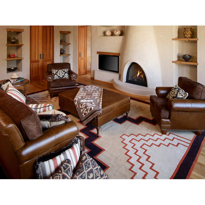
Ethnic prints are another favorite trend of mine from this year – we found them in pillows, curtains, rugs and even upholstery. There is nothing quite like adding a bold pattern into an area to spice things up and add a bit of personality to the space. This past spring and summer you may have seen a lot of Moroccan or lattice like patterns; these worked great for those seasons since these styles tend to incorporate bright colors. While bright yellow or turquoise may have worked out great in the warmer months, this fall we’re ready to get down with the mustards and burnt oranges of color world; what better way to welcome this color scheme and keep with our ethnic print trend than a Navaho or tribal print? While checking out these patterns, be sure to notice all the great natural fibers like wool that they are usually associated with.


Another popular trend, and one that I expect to see a lot more of in the year of 2015 is brass – it’s coming back and in a BIG way; antiqued brass done in the right way can look extremely luxurious. I love to use the light feel of silver and brushed nickel tones in the spring and summer, but as fall and winter come back around I can’t help but to pull in the warm tones from copper and brass (winter is my favorite time to mix all of the metal tones). Adding in some warm toned decorative pieces, lamp bases or artwork is a great way to bring vintage warmth into your space.

2014 has been a good year for me; everything that I have been in love with for years has really started to gain popularity and this does include animal hides. Once again, we’ve found this trend in rugs, artwork and even furniture. In the warmer seasons, we saw a lot of zebra and snow leopard…why? Well, with the bright colors of the spring and summer, it’s easy to pair a black and white print with just about anything. In the cooler season of fall, we tone down our color scheme and therefore are able to use textiles like cow hide, or some other more natural looking faux furs. With this trend, it’s important to remember that a little bit goes a long way and mixing these fabrics with metal studs always seem to go together.


There were so many new trends this past year, this blog post could go on forever; I’ve decided to focus on my favorite top five and that brings me to my last trend – light woods. Dark woods were huge in the past five years or so and don’t get me wrong, I still love them, especially for floors. The newer trend is the honey toned woods and yes that means your oak and cherry are back in style! Something that has been gaining more and more popularity is having that unfinished look to your woods, really showing off that natural grain. Who knew that all you had to do was sand down your wood a little bit and you’d have a high end look that companies like Restoration Hardware charge a lot for! In the fall, a design feature that I notice a lot is wood and the many varieties that we see out in nature. So, if you have a lot of dark wood, try adding one of these unfinished lighter wood pieces to your space and vice versa; if you already have the light woods, add a darker piece for some variety and depth.


Make these design trends work for you in each season! 

Wednesday, October 1, 2014

Style Mania Continued!

As promised, in this blog post we will continue to go over the different types of design styles out there and what sorts of elements you can bring into your space to further enhance these types of décor.  Last month we talked about the most common types of styles; traditional, transitional, contemporary, modern (and mid-modern) and shabby chic versus eclectic. You may have found that you don’t really fit in with any of these genres and that may be because you have found yourself further in a design niche and that is exactly what the this months blog post is for! Let’s jump right in.

Arts and Crafts: Also known as American Craftsman, the focus here was simple and put purely on form. No embellishments were needed because the way that furniture and materials were put together was more than enough to catch the eye. Within this style you will find many handcrafted items made from wood, glass or metal. Since the focus here was not on colors or furnishings, it’s much easier to spot a craftsman style home based on certain architectural features that it may have; for instance most craftsman kitchens will harbor a breakfast nook.

- Arts and Crafts  -

Art Deco: Although this style originated in France, this style reflects the mood during early 20th century – sparkling, bright and cheerful. This genre mixes craftsmen motifs with machine age imagery and materials, embracing the new technological developments. Here you’ll find bold jewel tone colors and geometric patterns offering sleek lines in the flooring, architecture and furnishings. This is not to be confused with Art Nouveau which focuses purely on organic shapes as opposed to geometrical. Within those furnishings you’re likely to find mirrored surfaces, lacquered cabinets, chrome and glass lighting fixtures and zebra skin accents added for those exotic embellishments. There is not a more lavish, exuberant and glamorous style than art deco.

- Art Deco -

Oriental: Asian inspired design has a flare of its own, inspired from countries such as Japan, China, Thailand and Vietnam. Feng Shui was derived from this style and some a lot of the same elements that Feng Shui requires show up in the oriental style, such as natural fibers and colors to create a serene and Zen environment; this design is focused around positive and negative energy. Bright colors show up in hand painted furnishings, iconic statues may be strategically placed and you may see fine china in the space made from a very specific oriental blue and white; which were considered prized possessions by European royalty.

- Oriental -

Moroccan: A style that has become more and more popular over the years with its lavish textures and patterns is Moroccan; it should evoke warm feelings of wonder, luxury and sensuality. This is a heavily layered look, whether that means having a carpeted floor with a wood trim and a rug, or numerous layers of intricate pattered blankets on your bed. This is a genre filled with mosaics, bright jewel toned colors, heavy textures and ornate wood carvings. Some typical Moroccan furnishings would be a Persian or Oriental rug, pattered pillows, poufs or side tables.

- Moroccan -

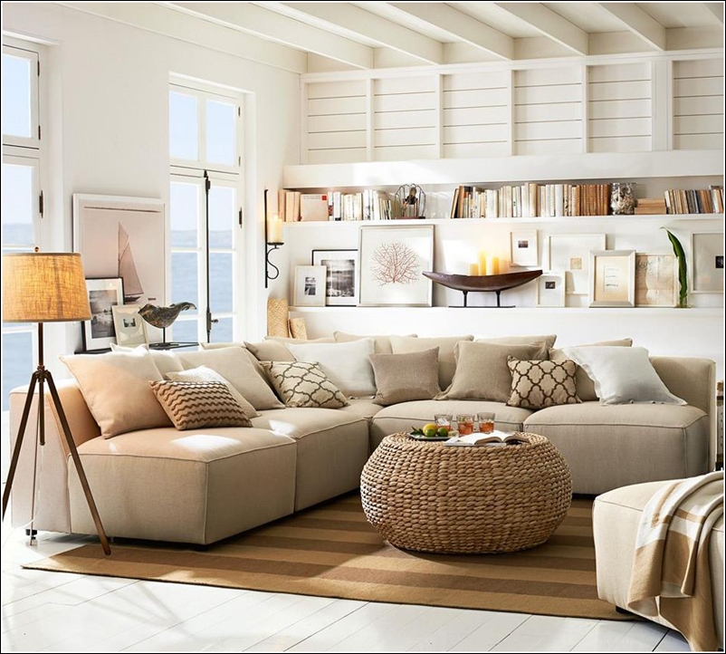
Coastal: Last, but certainly not least, is Coastal – very common for the West Michigan area in which we are based. This is a look inspired by the ocean, lake or really any body of water and should evoke a light and airy feel like as if your doors and windows were always open. A nautical color palette of red, blue, white and gold is very typical in these settings and lighthouse, seashell and other nautical embellishments are the most used decorative accents. If you are looking for a coastal feel without using the typical method, perhaps an all white back drop is for you and focus more on textures that you would find at the beach, such as rope or stone, and incorporate it into your furniture.

- Coastal -

While there are of course even more design styles out there, hopefully we have covered most of your preferences with the big top five and these more intricate niches. Have we missed your favorite genre? Leave us a comment and we’ll be sure to fill you in!

Tuesday, September 2, 2014

Style Mania!

When it comes to designing your home, the first thing that you should decipher is the type of style you’re looking for. It’s a common misconception that the only styles available are traditional and modern; on the contrary, I like to think of these two tastes as the design extremes with many others in between. In this blog, I’m going to talk with you about some of the most requested styles and give a little insight into what makes them unique in their own way. Use this as a guide to help you figure out what style you’re attracted to and what elements you can add into your space to help elevate the overall design!

Traditional: We could get technical here and talk about how most of the furniture used in this style resemble furnishings of 18th century English and 19th century neoclassic or French country revival; but unless you were an art major or have taken a few art history classes, this probably doesn’t mean a whole lot to you. So, let’s get to the basics – traditional design will incorporate a lot of floral, plaid and stripe patterns. You’re most likely not going to find bright colors that pop here, but more of a muted and toned down color scheme. Typically, you’ll find more ornate detailing here, for instance carved out designs in the wood trim around upholstery.

- Traditional -

Transitional: Ah, one of the most common design styles around. As a designer, I often work with clients who own quite a bit of traditional furniture but wish to move towards a more contemporary style without getting rid of everything they own. Transitional design allows us to work with elements from both traditional and contemporary styles to create one cohesive design. The color palette here pays tribute to traditional design in the sense that you’ll see a soft color palette. However, transitional design uses neutral colors – it’s important to understand that muted and neutral colors are different. The most important element in this style is line – clean lines to be exact. Gone is the ornate detailing and small patterns of traditional design. When it comes to being transitional, the more simplified you can make your home, the better. Stores like Pottery Barn are so popular because the majority of their furniture is transitional.

- Transitional -

Contemporary: The design style for the young and hip, but not necessarily the most practical or comfortable, is contemporary. Similar to transitional design, contemporary offers sleek, clean and streamlined lines. However, a big difference here is the bold use of color used in this style – not necessarily on every wall, but don’t be surprised to find one bright red wall used as an accent. With this style, colorful graphic art can be found on the walls and low furniture with metal framed legs can be found on the floor. Contemporary design likes to bring us back to the basics.

- Contemporary -

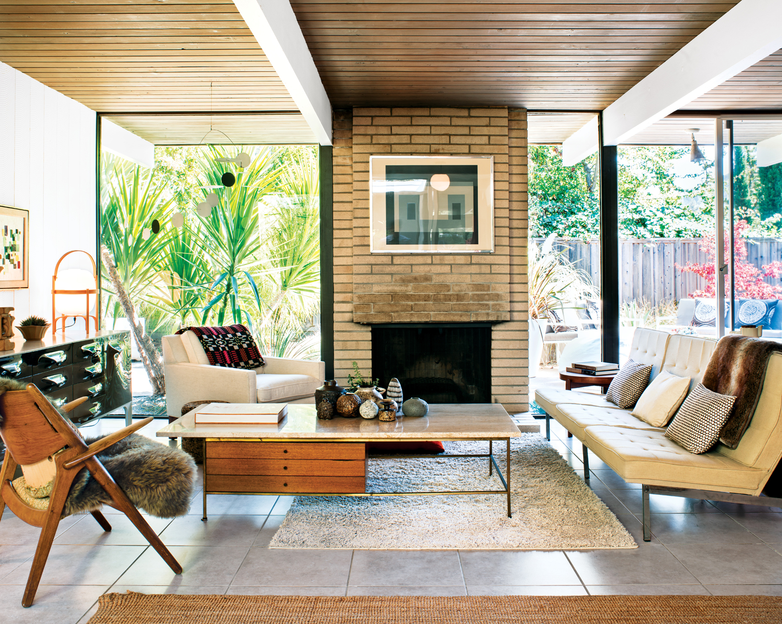
Modern: Modern design is where we find our minimalists due to the clean, exaggerated stream line concepts that we find within this style. With a modern taste come geometric shapes, asymmetry, high gloss surfaces and high contrast with colors – think black and white. This is not to be confused with mid-century modern design which also has elements of simplicity. Mid-century modern design will most likely include pops of muted green, brown and orange and organic shapes due to the fact that the height of this design concept took place in the 60’s.

- Modern -

- Mid Modern -

Eclectic vs. Shabby Chic: These two styles often get looped together but could not be more different. Eclectic is the style of someone who loves all of the design elements and just has to have them all! Colorful and bright fabrics and patterns are the most important element of this style, and having plenty of them. They must all coincide together and add a whimsical feel to the space. Shabby chic on the other hand focuses on weathered or white furniture with muted colors, if any. This can tend to be a very feminine style due to the floral motifs found within it and the vintage accessories used as decoration.

- Eclectic -

- Shabby Chic -

There are of course numerous other styles, such as Arts and Crafts, Moroccan, Art Deco, French, Farm House, Western and more. Stay tuned for our next blog as we go over some more of these niches!